 |
 |
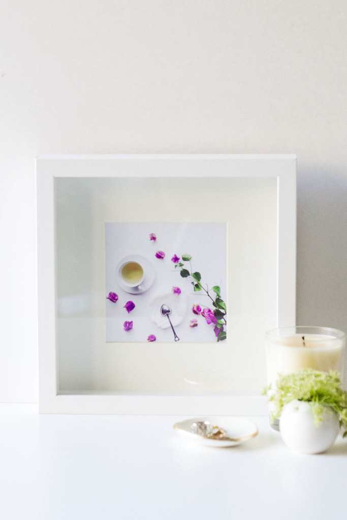
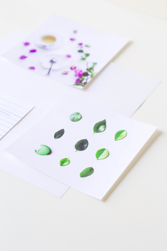
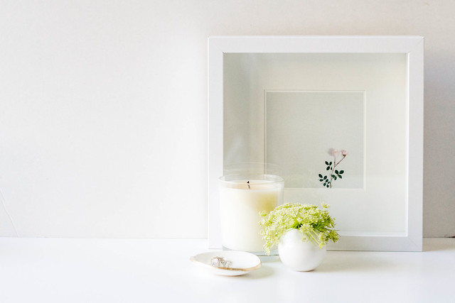
I recently had the opportunity to donate a print to the Coalition of Humane Rights of LA. It was a 10" x 10" print with a 12" x 12" frame. I then dabbled with some smaller prints that are 5" x 5". What do you think? I rather like the white frame more than the black but go figure, right?

In other news, I shared a little Floral Study on Claire's lovely blog south by north. Hop on over for some still life's of dahlias and phloxes. Would love to hear your favorite floral arrangements. It is summer after all and what are seasons if not shown by seasonal flora? :)
These are so gorgeous! I agree -- the simplicity of the white frames is just perfect. :)
ReplyDeleteThanks, Diana! Yup, we definitely have a similar aesthetic! :)
DeleteThese are lovely!! I would love to have them in my room :)
ReplyDeleteaww thank you so Maru!! :)
Deleteyour work is flawless
ReplyDeletexx
thanks so much! appreciate the kind words xx
Deletebeautiful tana! i think i may know the organization you donated it to!
ReplyDeleteNo way--that's awesome!! Thanks Jane :)
DeleteThanks!
ReplyDeleteThese are so pretty, Tana! I really love the last one - simple yet attractive! And I completely agree with your choice of frame. White is the best in this case! :)
ReplyDeleteThanks so much Yuni! Always a fan of simplicity :)
DeleteBased on your blog (and Instagram account) I have surmised that you have a thing for flowers don't you? :) And I normally prefer white anything to black anything. It gives a clean, minimalistic look. Draws the eyes right in. Your prints are beautiful btw. You presented them well.
ReplyDeleteSo cute!! I really like the one with the green leaves :)
ReplyDelete